Legacy Content Warning
This section of our website is no longer maintained and may not be accurate or reflect our current ideology. Please report any content you believe to be inaccurate to [email protected].
Blog
Website Design Anatomy: Designing a Pricing Page
If your prices are presented the right way, then you can turn your visitors into clients. Learn how to design an effective Pricing Page with the help of some pro tips.
Florence Alcantara
Jul 15, 2020
Companies and professionals alike are realising the importance of a website to their business and careers. It is one thing to have a website and it is another thing to have an effective website. Every effective website design follows a set of principles and fundamentals. For instance, every single design tutorial will tell you to use high-quality graphics or to stay consistent with your branding. Admittedly, we are guilty of emphasizing these tips on design-related blogs.
However, different website pages have individual purposes. So your design should support the goals each page is meant to accomplish. For instance, your About Page needs to effectively tell your visitors who you are and what you do, while the goal of your Services Page is to help your target market understand why they need you. So you need some page-specific design tips to make sure that each one of your web pages is equipped to do their job right. Let's put the Pricing Page on the spotlight.
What is a Pricing Page?
The Pricing Page is where people check if your services are not only suitable for their needs but are also suitable for their budget. People who check the Pricing Pages are generally set on the kind of services that they need, they are just checking their options in terms of affordability or practicality. They are either comparing the inclusions of each of your packages to understand which one is the more practical choice or they are comparing your prices against a competitor brand.
Some website design adds a pricing section on their Service Page and that's okay! This style applies to companies that offer more than one kind of service. For instance, MJWebs offers web hosting and website design service among other digital services, so simply adding the prices as a section within each respective service page makes it easier for visitors. Keeping all the prices and packages for different services on one page can AND will be confusing for some.
Factors to Consider When Designing the Pricing Page
Here are some factors to consider when working on your Pricing Page for an effective website design:
People need context.
You need to help your visitors understand your prices and inclusions. People are wary of things that they don't completely understand, even more so when it involves money or when something is at stake. If your target market doesn't understand what your inclusions are and how suitable they are for their needs, then they'll think that your offers may be too expensive for them.
Potential clients can experience decision fatigue.
Limit the choices you offer-- this doesn't mean that you can't be flexible. However, overwhelming your potential clients with details and choices can intimidate them or end up with decision fatigue. For instance, when you're shopping for perfume, you need to take a break because after a while the scents start to smell the same to you. Your packages will start to look alike if you have too many of them.
Some people need a little push.
Some people like to be extra careful with their decisions to the point that they can't decide at all. You need to give them a bit of a push. You can either do this by giving them an offer that they can't refuse or adding some urgency into the equation. The first option can be arranged through negotiation and the second one is presented in the form of scarcity or limited availability.
Key Parts of an Effective Pricing Page
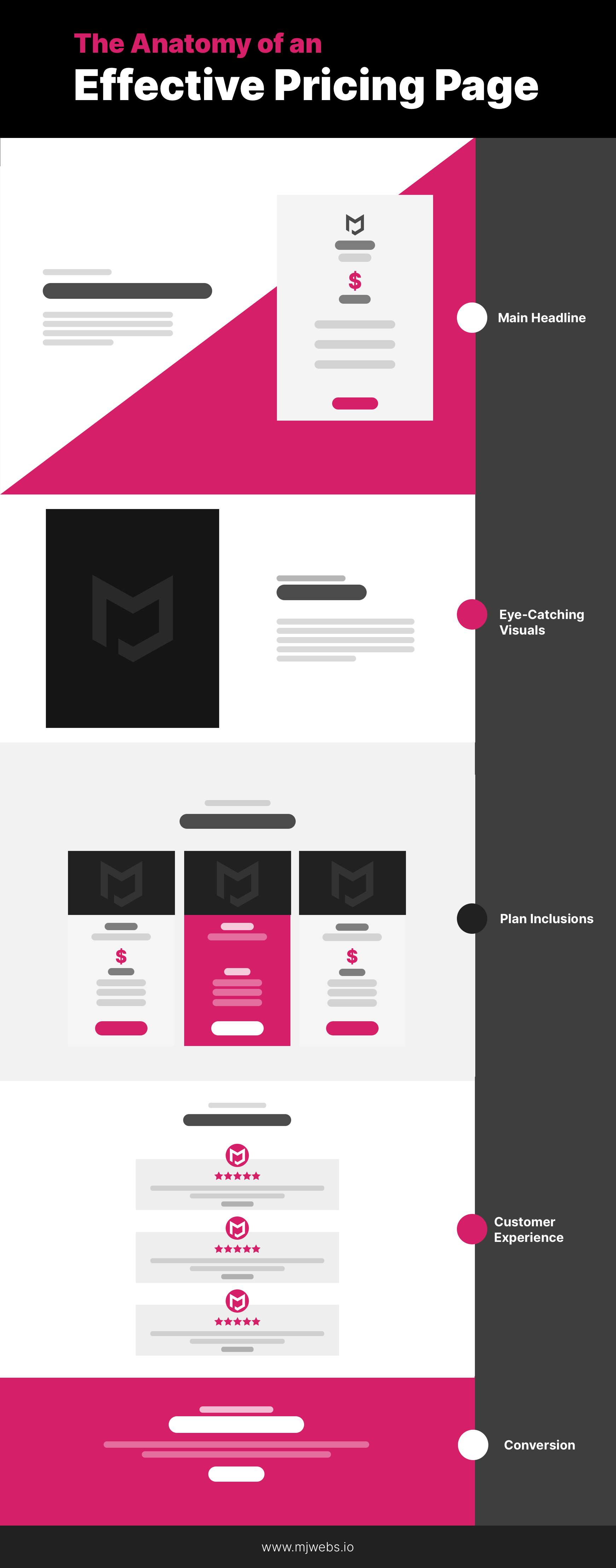
There is no one way to design the Pricing Page, but it does help to understand that you need its key elements for it to be effective. Here are the key elements of an effective Pricing Page:
Main Headline
Most of your website pages need a headline, your Pricing page is not an exception to this. Always go for something that will hook your site visitors in so that they continue to browse the page.
Eye-Catching Visuals
Use relevant visuals to keep your site visitors on the page, but of course, the images or graphics you use should be relevant to your company, services, and pricing. Don't add an image just because, it should give value to your page.
Plan Inclusions
Usually, companies offer three sets of plans on their Pricing Page. Now, people will want to know what exactly they are paying for and how you ended up with those three price points. This section will also help people compare which plan is more suitable to them.
Ratings and Reviews
Your pricing page needs a testimonial section as much as a Products or Services Page does, this section helps your visitors see that you are a trusted company in your industry.
Call-To-Action
These little encouraging buttons are the push your potential clients need to proceed. Strategically placing them in your pricing page will help you gain leads or better-- a client.
Website Design Tips for an Effective Pricing Page
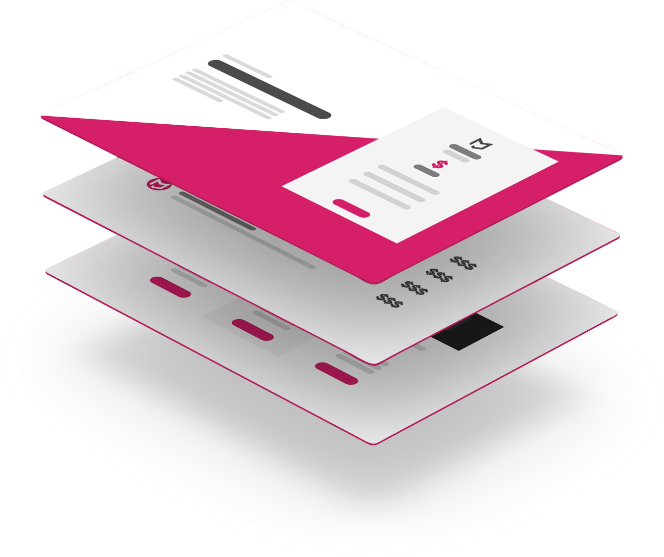
Now that you've learned the factors to consider when designing your Pricing Page, it's time to learn some design, layout or section suggestions.
Offer something for free.
Free things excite people. You can offer free trials, resources, etc. Potential clients consider freebies as low-risk decisions. Free trials of your services can help them give you a fair evaluation and remove any doubts that they may have about your company.
The magic number is three.
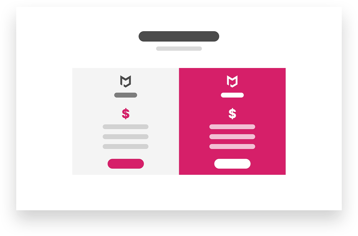
As mentioned previously, you should limit the choices on your pricing page so the maximum level of price tiers on your Pricing Page should be three. Your goal is to present enough information so that your potential clients can make informed decisions but not too much that they'd be overwhelmed.
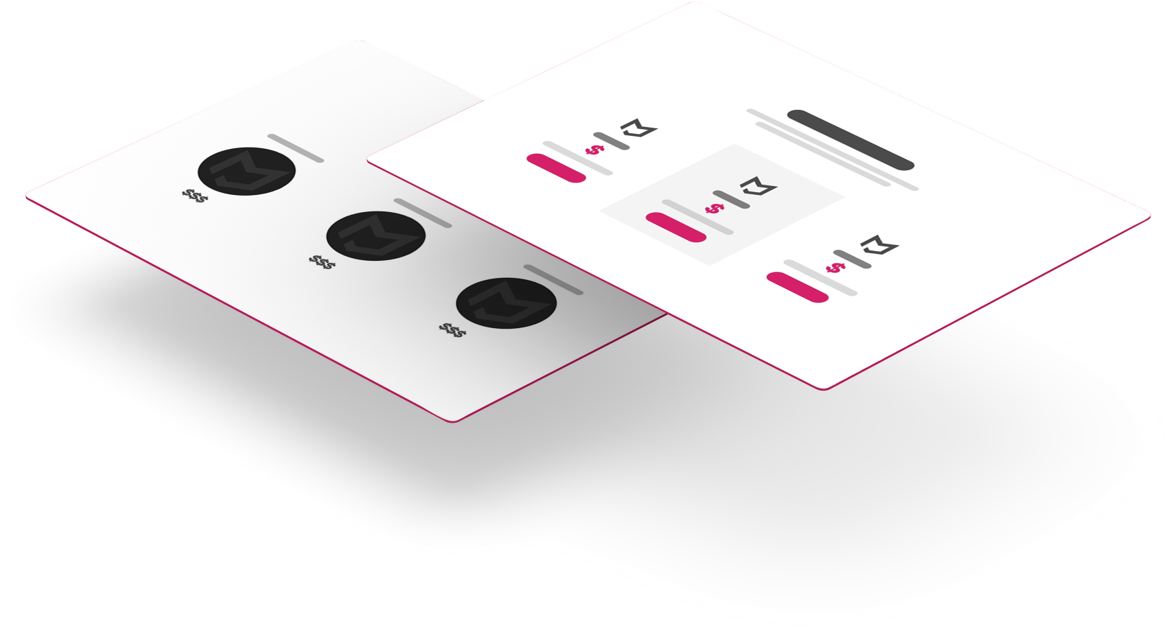
Add customisation options.
As mentioned above, you don't want to overwhelm your potential clients with details, but this does not mean that you should be inflexible to their needs. You can add a section with sliders or dropdown options where they can customise the inclusions and see how much it would all cost. Another option is adding a CTA or a form where people can request for a free quote or consultation.
Strategically place multiple contact options
Adding different options to contact you makes it easier for potential clients to seal the deal. Live chat pop-ups are quite common nowadays.

Highlight your value and benefits.
Your content and design should all reinforce the idea that your services are valuable to your potential clients. Highlight your benefits and best features. You can do this by using the right colours, font and size-- all of which should follow your company's branding.
As much as you want to say that ALL your plans are amazing, keep in mind that if everything is special, then nothing is special. How do you know which pricing plan to highlight?
This part entirely depends on you, however, here are some things you can consider while making a decision:
- Middle tier plan - A lot of people don't want to go to extremes when just starting out. The middle tier plan will appeal to those who are still testing the waters.
- People's choice - Look at your plans from a user's perspective then recommend what you honestly think fits most clients.
- Top tier plan - You can do some price anchoring. If they see the most expensive plan first, they will feel like your middle-tier plan isn't so bad in terms of price.
- Free trial - Sure this means that you'd be doing free work for a while, but it opens up an opportunity for your potential client to upgrade to paid services.
Choose your CTA language wisely.
Your language should match your visuals and the image that you are trying to build for your brand. For instance, your website generally uses pastel colours, and you claim to be a friendly company-- using generic business languages like submit, download or buy now isn't recommended. Why? Because they sound cold and impersonal which is obviously not working with your "friendly" theme.
Regardless of what image you are going for, you want your target audience to feel comfortable reaching out to you. Cold business language is not going to help you in that aspect. On top of not using generic business language, you should use more languages that emphasise the next action like "Set Up a Meeting" or "Start Your Free Trial".
Learn how to highlight elements.
We've mentioned a lot of things that you should highlight on this page. The simplest way to do it is through the use of colours and size. For instance, you have three price tiers on your Pricing Page, if you want your recommended plan to stand out, then it makes sense for you to use colour in contrast with the rest of the other plans. You can also use bigger fonts or graphics for the areas that you want to highlight.
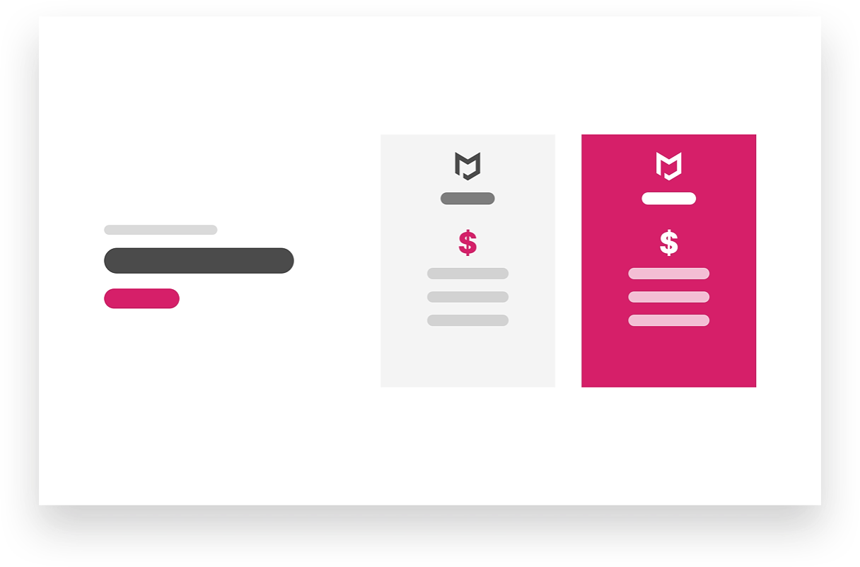
Add credibility indicators.
You can never have enough credibility indicators. They're like gentle reminders to users that you are a trustworthy company. For the About Page and Services Page, adding a review and rating section is recommendable.
For the Pricing Page, you may want to consider also adding free trials or money-back guarantees. These little things will help your target market feel that you care for them and that you're not only out for money. Profit is good- yes, but a long-term relationship with clients is the priority. But you know, nothing is stopping you from obtaining both. (wink)
Prices should be easy to compare.
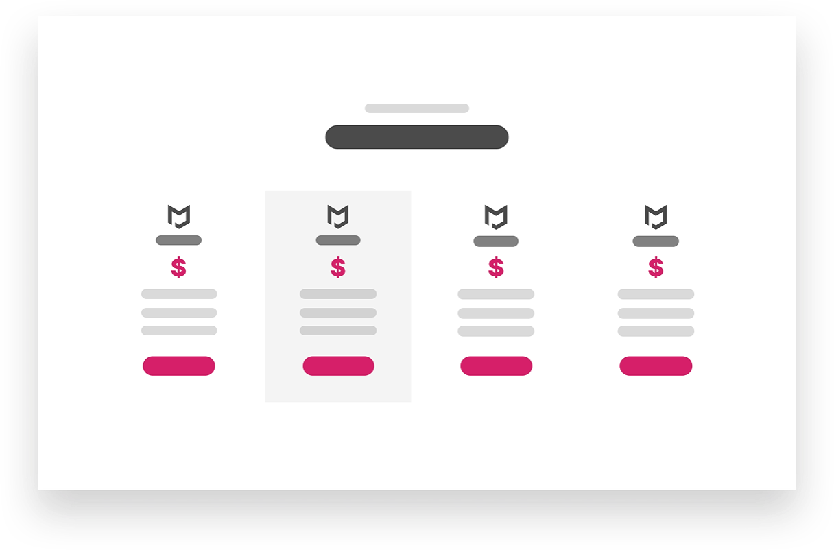
Your layout should not be confusing. On top of limiting your plans or price tiers to three, they should be designed in a way that people can see their differences clearly.
Conclusion
Congratulations! You are now equipped with pro tips in designing a Pricing Page. Just a quick rundown of everything here:
You need to accept that people like things presented to them in pretty bite-sized portions. If you don't pique the users' interest or if you complicate anything in your website design, then expect that they'll skim and probably go elsewhere.
The Pricing Page is already complicated as it is, so you need to make sure that your design makes it easier for potential clients to understand. Focus on how you can make your Pricing Page information-rich in the simplest and most organised way possible. Help your visitors decide by highlighting the benefits of working with you and your best pricing plan. Gain their trust by adding credibility indicators here and there.
Remember that the best Pricing Pages requires you to find the sweet spot between giving users all the information they need while reducing or completely removing anything that might overwhelm or discourage them from proceeding with your services.
Web Design Anatomy
In-depth documents about common website components and how to leverage them.
Website Design Anatomy: Designing a Services Page
Website Design Anatomy: Designing a Pricing Page
Website Design Anatomy: Designing a Products Page
Website Design Anatomy: Designing a Header