Legacy Content Warning
This section of our website is no longer maintained and may not be accurate or reflect our current ideology. Please report any content you believe to be inaccurate to [email protected].
Blog
Website Design Anatomy: Designing a Services Page
The Services Page is for selling the services your business offers to clients. Learn how to do it right.
Florence Alcantara
Jul 08, 2020
There is more to a website than just being an information dump for internet users. If a website is designed correctly, then it can help a business grow and a professional to gain some following. What else is there aside from an attractive Home Page and a compelling About Page? You still need a Services page! Well, unless you are offering products-- in that case, you need a Products page-- but that's for another article. So what do you need to learn about an effective Services Page website design?
What is the Purpose of a Services Page?
As the name suggests, the Services Page contains the details of the services your company offers. It is usually one of the links up on the main menu. Having a Services Page is important for a company since it will help new visitors and potential clients what you can do for them. If the About Page is all about introducing your company and, sometimes, your team-- the Services Page is all about presenting what you can do for your clients.
You should make your Home Page and landing pages interesting so that your visitors will get hooked right off the bat. Internet users generally get the basic idea from your Home Page or sometimes your landing page if that's where they landed (ba dum tss). If they like what they see, then they will dig deeper to find more information about you and your business.
Does Your Website Really Need an Effective Services Page for Your Website Design?
If your business offers services, then yes. Let's paint a picture. A potential client stumbles upon your website, they find your Home Page really interesting. You left a summary of your services somewhere on the Home Page, and just like a cliffhanger to a TV series, you've left them hanging and wanting more. They'd think Strange, this site does not have a Services page. Maybe I'll find something on the About Page. Alas, the About Page focused on your story as a company and the description of your team. Since your visitor did not find what they need, they leave for a competitor brand.
Your Home Page may be able to catch your target market's attention, but that is not enough to seal the deal. Getting their attention is not enough to make them reach out to you. For example, you're looking for a movie to watch-- you don't go ahead and play the movie after being interested in the poster. Once a movie poster catches your attention, you check its genre, its summary and ratings. You don't want to waste your time.
Now, remember that you are running a business and none of your potential clients wants to waste their time AND money either. Long story short, don't leave them hanging. They deserve that Services Page. Give it to them.
Situations Where You Don't Need Services Page
Although having a Services Page is recommended for most businesses, some scenarios exempt you from direly needing one. These situations include the following:
You don't have services.
As mentioned previously, if you offer products instead of services then you should have a products page instead of a Services Page. It does not make sense for you to have a page dedicated to something that you don't have. It's like preparing an anniversary celebration for a non-existent spouse.
You are well-known and you get a lot of referrals.
Word of mouth can do wonders. If you are well known in the industry or if you get clients through referrals then it's okay not to have a Services Page. Your clients probably know what you do before they even try and contact you. They would have heard all about you from a friend or a business partner.
You have a good work portfolio.
There are cases when your work portfolio speaks for you. If you are confident that your site visitors can figure out what you do based on your work portfolio, then go ahead and skip the Services Page.
You think that being mysterious is a good idea.
If you are confident that your homepage is enough to really make your visitors wonder what you do then sure, you can wait for them to reach out to you to ask. Being mysterious sometimes works in encouraging people to ask questions. But keep in mind that this does not always work.
How to Design an Effective Services Page
Physical stores have a couple of salespeople to help them seal the deal with their walk-in customers. A salesperson is there to give potential customers an idea about the store's products and services. They highlight the strengths and benefits of the brand they represent. Now, consider your website as a virtual store and your Services Page as the salesperson working hard to convince your visitors to choose you over your competitors. Here are some tips for designing an effective Services Page:
Make it easy to find.
The Services Page is normally one of the links on the main menu. This makes it easy for your visitors to find. Don't give users a hard time looking for your services. A salesperson should not hide behind a rack of clothes when a potential buyer is obviously in need of assistance.
Make your headline interesting.
This tip is applicable on all your pages that have headlines. The headline is the first thing users will read on a page. Your headline affects a user's decision whether to scroll for more or to leave.
Make it readable.
There are two kinds of being readable. Making your Services Page readable means that it should be aesthetically pleasing. The colours and layout should help your visitors go to where you need them to be-- it should be designed with fonts and colours that are easy to read.
Then, your Services Page should also be readable in the sense that the content is easy to absorb. A big block of text is not a good idea and neither is using big confusing words. Congratulations on having a massive word bank, but so sorry for losing a potential client due to difficult words. You indeed need to make sure that your visitors are aware that you are an expert in your industry, but keep in mind that being understood is more important than sounding smart.
Add a Q&A section on your Services Page.
In the spirit of making content readable, you should add a Q&A section on your Services Page. These small chunks of information can help your visitors better absorb details about your services. Plus you can get into specifics here.
Use CTAs (Call-to-Actions)
CTAs are recommended on Home Pages and landing pages since they can lead your visitor to where you want them to go. However, the Services Page is one of the most effective pages to place CTAs. Why? Most internet users don't go straight to the Services Page out of sheer curiosity. Usually, before people go to the Services Page, they already have an idea who you are and what you do-- this means that they are already interested in your services by the time they check this page out. All they need now is a little push, which is your Call-to-Action.
Take advantage of visual elements.
Videos and images are highly recommended for an effective website design. Visuals aids like images, graphics or infographics help readers understand your content better while videos are a fun way to present your services or maybe even show a demonstration.
Share customer stories.
Aside from the About Page, the Services Page is a good place to add your customer stories and reviews-- this will assure potential clients that you're amazing at what you do.
Make sure you are consistent.
Your website design should have a consistent layout and feel. It should follow your brand and it should follow a theme. Consistency in design will help users follow each component of your Services Page.
Let them know what makes you unique.
Describe your services. Who will benefit from it? What ARE the benefits? You need to help them understand the importance of your services and how you can help them.
Key Parts of an Effective Services Page Website Design

Even if you've made a strong impact as a company through your Home Page or About Page, you also need to make sure that your services appeal to your target market.
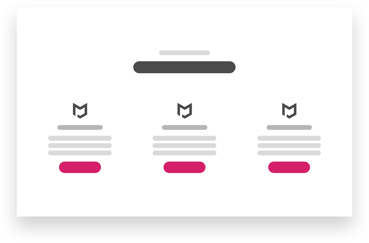
Here are the key elements that your Services Page should have:
Header / Intro
You need a catchy line to place here. It should be something that will get your target market's attention. You can either assure them that you can relieve them of their pain points or something along those lines.
Featured Service
If you offer a number of services, you can pick a favourite and add it here to make it stand out. This section also works for companies with specialties. For instance, a law firm can handle a number of different cases of different nature, but some law firms specialise on business cases or some on workplace issues.
Services Display
If you have multiple services, you can use this section to show what else you offer. You can link each respective service to their respective landing pages. If this is a dedicated page for one service, use this to highlight its benefits and inclusion.
Customer Experience
Your Services Page needs some love too. Show off testimonials from happy and satisfied customers here. Also, this is one of those things that will help you gain your site visitors' trust.
FAQ Section
Offer some bite-sized information to your visitors. Some clients have specific questions and it will help them understand you better if you provide the answers in this section in Q&A form.
Serviced Location
This section is where you add your locations. You must let people know where your branches are so they have an idea about where to get your services.
Conversion
Time to give your potential clients a little nudge. Place an enticing call to action here. They have already come this far in your website, this means that they are interested. Go ahead and give them a sign that you're the one.
Conclusion
Your Home Page and About Page will help you get the attention of your target market, but the Services Page will seal the deal-- more or less. As mentioned previously, most internet users are just confirming what they believe you do by going to your Services Page. Once they are sure that you can provide them with the services they need, all there is left is to let you know that they are interested in working with you. Effective website design does not stop at one page. Consistency is the key.
Web Design Anatomy
In-depth documents about common website components and how to leverage them.
Website Design Anatomy: Designing a Services Page
Website Design Anatomy: Designing a Pricing Page
Website Design Anatomy: Designing a Products Page
Website Design Anatomy: Designing a Header