Legacy Content Warning
This section of our website is no longer maintained and may not be accurate or reflect our current ideology. Please report any content you believe to be inaccurate to [email protected].
Blog
Website Design Anatomy: Designing a Products Page
Proud of your products? Do them justice by creating an effective Products Page that highlights their value and benefits.
Florence Alcantara
Aug 14, 2020
Websites are useful marketing tools in the age of information. The digital age gave way for consumers to do their thorough research before investing in a service or product. Businesses must keep up with the times and ensure that they give their target audience an adequate amount of data without being uninteresting. Service-based businesses have-- well, a Services Page to give people an idea of what they can do. That said, businesses dealing with products obviously should invest in effective website design with an efficient Products Page.
If you specialise in a certain kind of product or if you simply want to boost the sales on your physical store, then you can settle with a Products Page that highlights your goods. However, if you deal with a bigger range of products or if you want to expand your horizons, then you should give e-commerce a shot. An effective e-commerce website will boost your business performance especially because it allows you to reach more people.
Purpose of a Products Page
You already have a Home Page and an About Page where you can feature your products, but why do you still need a Products Page? For starters, adding ALL your product in either your Home Page or About Page will make these pages too long. Longer pages can discourage your website visitors from reading further. On top of that, it makes navigation difficult for users.
Here are other reasons why you should have a Products Page:
It helps you highlight your product's selling point.
You need to highlight the selling point of each one of your products to convince people to buy it. As mentioned previously, adding too much content on one page will make it too long for people to read. They will lose interest before you get to your main points.
You may add a quick summary of your products on your Home Page just to inform people that you offer that kind of merchandise. However, each one of these short descriptions should link to another page for more information. You can't expect to make a sale from a "This product is awesome", you need to list down the reasons why, and surely, it will not be brief.
It gives site visitors a better idea of what your product does.
The Products Page is a great place to add videos of demos of how to use your product. This feature is especially useful if your product is the first in the market. Generally, videos are big files, and they can potentially slow down a page, especially when packed with a lot of visual elements. Slow loading page will drive potential customers away and lower your SEO ranking.
Learn more about improving your SEO here, or you can let us help you.
It helps manage your target audience's expectations.
Although your website can be a digital equivalent of a physical store, you need to admit that it has some limitations. Since people can't see your product themselves, you need to represent your items through your website the best as you can. The Products Page allows you to do this.
It provides you with the opportunity to convince your page visitors that your products and your brand are to be trusted.
The Products Page gives you a place to put product ratings, credibility triggers, and other elements that helps people trust you. The more assured they are that your products work, the better.
Understanding Your Audience for Your Products Page Design
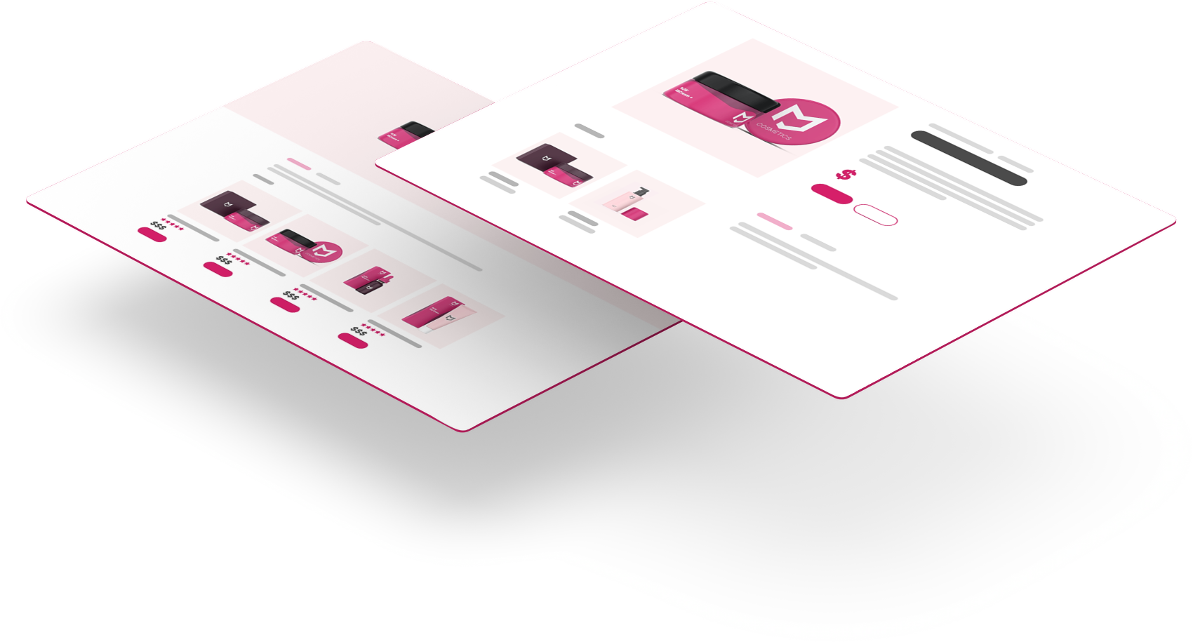
Branding is an important aspect of your design decisions from your company collaterals and packaging to your website. Representing your brand accurately should be one of your priorities. Why? Because your branding is one of the things that will help your target audience remember you. Of course, they'll remember you by the experience you give them as well.
What does branding have to do with understanding your audience or your website? Simply put, everything. Branding is all about reflecting your brand the right way and this involves considering what your clients think and what you want them to feel towards your company.
Understanding what your target audience needs or want will help you make your design choices whether you're still working on your branding or you're trying to apply your branding on your website design. Familiarising yourself with your target market carries a lot of weight especially when it comes to your Products Page. It can help you with the following:
- Understand what information to include on the page.
- Decide on a layout that best serves your goal.
- Lastly, ensure that your Product Page will help you sell your goods.
Design and branding take research especially when you're looking at boosting your sales. Sure, you can just go with your intuition, but the best way to go is still through testing and observation or research.
Parts of an Effective Products Page
There is no one way to design a Products Page. Different industries and goods call for a different approach. That said-- you still have the final say about how your branding should be integrated with your website design. Generally, you just need to apply the fundamentals of good website design and make sure that all the necessary elements are present. So, here are some recommended elements that you should have on your Products Page:
Product Headlines
Similar to regular headlines, the purpose of the product headline is to pique your visitor's interest. However, it should also describe what your product does and why your target market needs it.
Description
Websites have many benefits for both companies trying to promote their products and businesses who are actually selling their products online. A website can help them put their good in their target audience's radars.
However, the Product Page must be done right for this to work.
Sure, your website makes information about the product or the product itself accessible to your potential clients, but keep in mind that they don't get to see your product in person till they come in your physical store or until your product is delivered at the comforts of their home. You need to provide them with enough information to make an informed decision about buying your product or letting it go. If you put in too little information, your page visitor will question whether they actually need your product and you will look kind of sketchy which isn't good for your brand image. Your product description should:
- convince your customer that they need your product.
- persuade them that your good is better than the competitor's offers.
- accurately inform your potential customers about the components that are included in their purchase.
- explain how the product works.
- state what materials are used and why these materials are the best.
- explain what the product features are or you can save this for your Features Page.
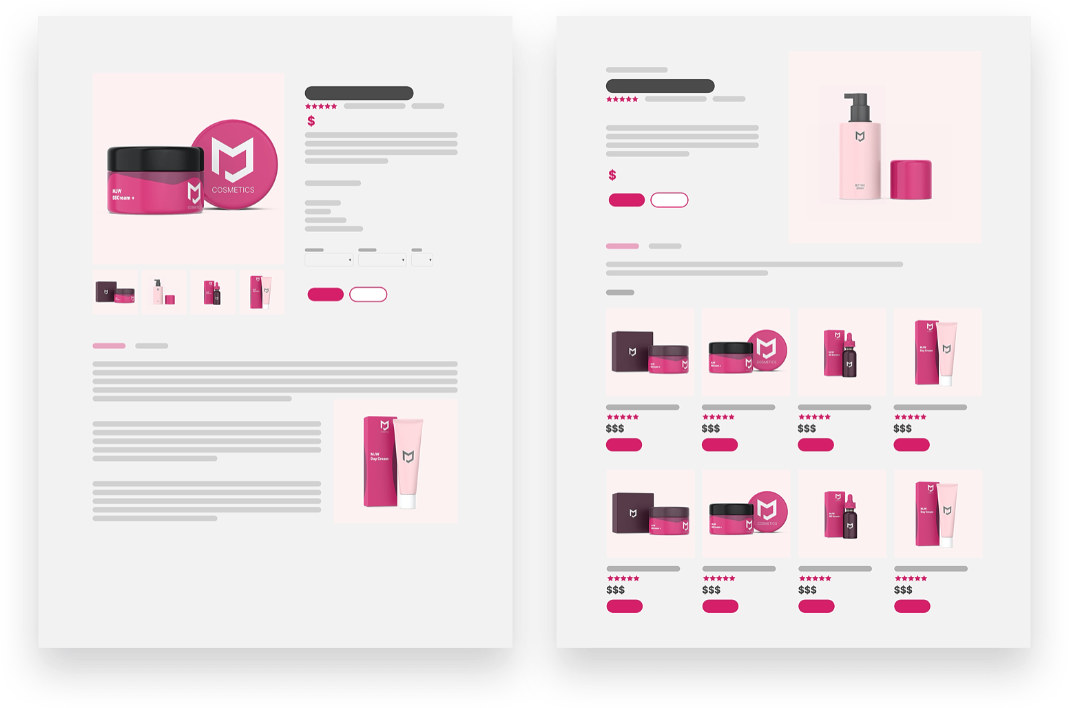
Your Products Page should help your website visitors visualise your products, not leave them with more questions.
Pictures
Okay, adding pictures to your product page is a no-brainer. It's common sense. Now, the surprising thing here is that some companies think it's okay to use low-quality images of their products-- some even use stock photos!
Using stock photos for a website is a common practice especially for service-based companies. It is okay for website headers, blogs and even on the body of the website for as long as the image is relevant to the content. However, it is not a good idea to use a stock photo on your product page. You need to show your potential customers what the product actually looks like.
For the best user experience, your product images should:
- be high-quality
- show different perspective
- show products in other colours (if available)
- have an option to zoom in
- should include any accessories that come with the product
Tip: You should have an "in-scale" photo of your product so customers can see the actual size of the product right away.
If you are offering A LOT of products or if you are going for an e-commerce website, then the high number of high-quality images will slow down the loading speed of your website, which is not good for both customer experience and your SEO ranking. You can either find a compromise regarding the image size or check your web hosting options.
Videos
A demo video is a good idea especially for innovative products that people have not seen before. Show potential clients what your product looks like and how to use it-- this will give them a better understanding of why they need your goods in their life.
Availability
For e-commerce websites, having an indicator of the number of stocks or if the product is sold out is a common practice. But you can also use your Products Page as an opportunity to inform potential customers that they can pick up your product in your local branches near them. Sometimes, customers just want to learn more about your product so they want to get more information about it. So it will help them a lot if they are aware of which branches your products are available.
Testimonials, Reviews and Ratings
Products need testimonials, reviews and ratings as much as services do. These things are forms of assurance that will encourage potential clients to believe in your product. Testimonials, reviews and ratings are useful for products hitting the market for the first time and products that have a lot of competition.
If your product is new, people will be a little wary of trusting it. Testimonials or reviews will help you put their doubts to rest. Ratings from satisfied customers will help your potential customers accept that your products work and that your brand is reliable.
Too many choices make it difficult for customers to decide which brand they want to put their faith in. So for products with high competition having testimonials and ratings can help show customers that you're the better brand.
Tip: Make it easy for your customers to leave a testimonial. Don't require your customers to log in for them to be able to leave a review.
Recommendations
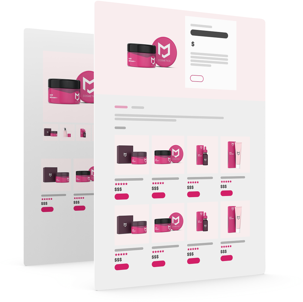
Add some recommended products in your layout. Let your website do the upselling for you. You're either helping your customer find things that they need or helping them realise the things they didn't know they need. You can recommend products that compliment their choice or suggest alternatives in case they need something else.

Conclusion
Running a business is already difficult as it is, the last thing you want to experience is running into some issues with your business website. Regardless if you have a regular business website or an e-commerce website, the way you present your products significantly affects your site and sales performance.
Keep in mind that although you own the business and that you are your own boss, you need to consider what your target audience thinks. You need to study their behaviour. Learning who your target market is will help you understand what kind of information, layout and design will best work in your favour.
You should make sure that you have added adequate product description and used high-quality images for your Products Page. If your product is new or unusual, adding a video demonstrating how it works can help you make your customers realise how your product can make their life easier. Also, your website design should show that you are trustworthy and that your products are reliable. Tooting your own horn does not always work, but adding testimonials, reviews and ratings from satisfied customers will do the job. You can always check in with experts when dealing with these things. Speaking of experts, MJWebs has web design services that you may want to check out.
Web Design Anatomy
In-depth documents about common website components and how to leverage them.
Website Design Anatomy: Designing a Services Page
Website Design Anatomy: Designing a Pricing Page
Website Design Anatomy: Designing a Products Page
Website Design Anatomy: Designing a Header